

"Color is a power which directly influences the soul." - Wassily Kandinsky
Welcome to our new series in The Science of Event Marketing, where we're exploring color theory. At its core, the color wheel is the fundamental tool that helps marketers and designers make strategic color choices. Understanding color relationships is crucial for standing out in trade shows and events, where you have seconds to capture attention.
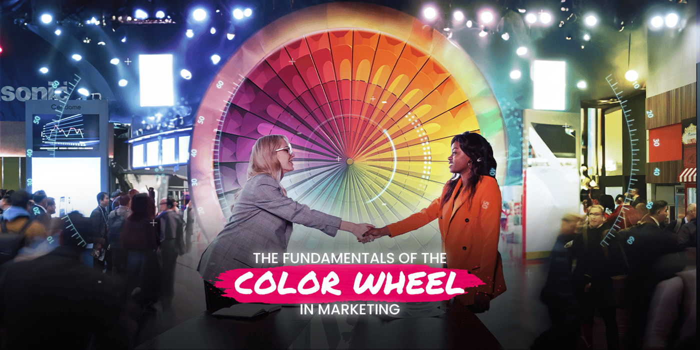
Let's explore our first color theory concept: the color wheel. This visual organization of colors provides the foundation for creating visually harmonious experiences that distinguish ordinary booths from impactful brand statements.
Understanding the Color Wheel
- Primary colors: Red, yellow, and blue - the building blocks from which all other colors derive
- Secondary colors: Green, orange, and purple - created by mixing primary colors
- Tertiary colors: Yellow-orange, red-orange, red-purple, blue-purple, blue-green, and yellow-green - created by mixing primary and secondary colors
Why Color Fundamentals Matter
- Creates visual hierarchy that guides attendee attention
- Establishes brand recognition across physical and digital touchpoints
- Influences perception of your offerings before a single word is spoken
- Separates your presence from competitors in crowded environments
- Ensures consistency across all marketing materials
Work Within Brand Guidelines
When applying color theory principles, many marketers face the challenge of existing brand guidelines that may limit color options. Consider these approaches:
- Work with your core brand colors as the foundation, then strategically expand the palette for events
- Create event-specific "sub-brands" that complement but don't conflict with main guidelines
- Develop special campaign themes that justify temporary color expansions
- Consult with your design team to find the right balance between brand consistency and event impact

Practical Applications
- For event spaces: Use primary colors for main structural elements to create clear focal points
- For trade show booths: Implement tertiary colors for sophisticated, nuanced branding that stands out
- For digital platforms: Ensure that color calibration translates accurately between screens and printed materials
- For brand consistency: Develop a precise color palette with exact values (RGB, CMYK, Pantone) for all applications
